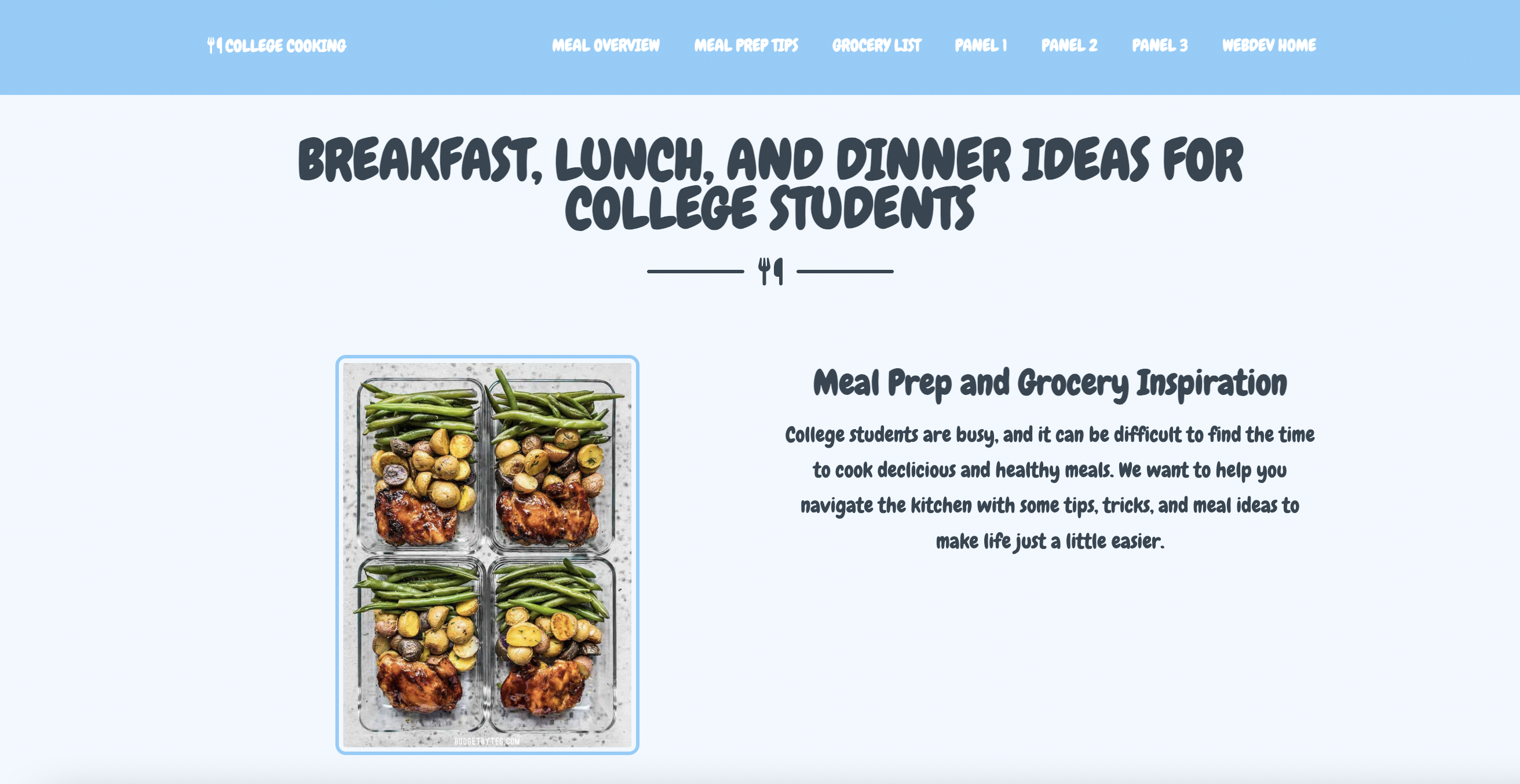
When creating panel one, I wanted to focus on creating a strong foundation of content for panels two and three. I feel that I struggled with overall aesthetics in project one, and wanted a chance to tap into my more creative side with this project. Starting any project from 0 is challenging, and it took a lot of trial and error. I knew I wanted to utilize cards from Bootstrap because I enjoyed playing around with them in class, but I encountered a huge challenge with sizing my card images. I ended but being able to resolve the issue in my custom.css, but the photo sizing continued to be an issue for me in all three panels. In the future, I would really like to work on organizing things such as image size from the beginning, to make the rest of the website design less stressful and complicated. I am particularly proud of my cards and accordion both from bootstrap, and I actually had a lot of fun getting to get creative with these elements. I also found that my font awesome utensil "logo" was the perfect addition to my website, and an element I was excited to build upon in panels two and three.
Panel One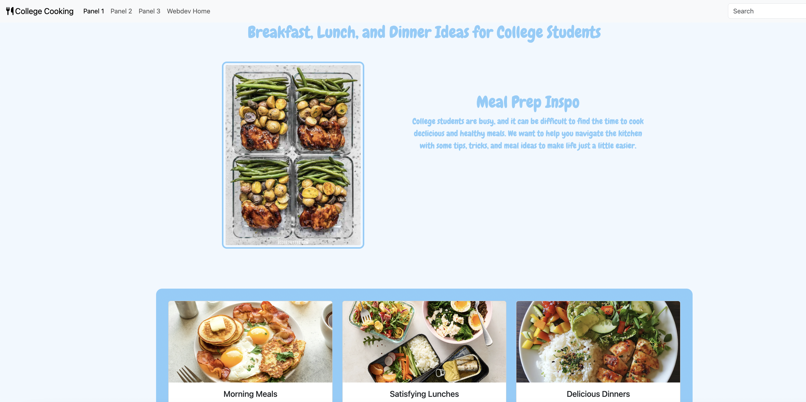
Panel two really made me realize where this project was headed. Using my content from panel one and putting it into a theme was more challenging than expected, and I did end up changing a lot around in my index.html. However, this panel made me realize that you can customize so much without using css. I had this previous notion that I had to use css to get a cohesive website, but I was still able to add font awesome icons, bootstrap elements, and lists just using code in index.html. It definitely made me more confident in my ability to navigate large index.html files, which can feel really daunting. Like I mentioned in the reflection above, I really wanted to get more creative with project two. One fun way I found to navigate this in panel two was getting creative with different font awesome icons, such as the shopping cart I added to my grocery list. I also decided during this step that I wanted to utilize the theme to add more pieces of content to my website, hence the grocery list, footer, and copyright logo. One element I could not get down was the image sizing on my cards in this panel. I had previously used css to make them all the same size, and without being able to use css I could not figure it out. I also attempted to resize the images on my laptop to re-upload them, but could not seem to get that correct either. While the aesthetics in panel two definitely looked a little funky, setting up a strong foundation within index.html made it a lot easier to focus on css in panel three.
Panel Two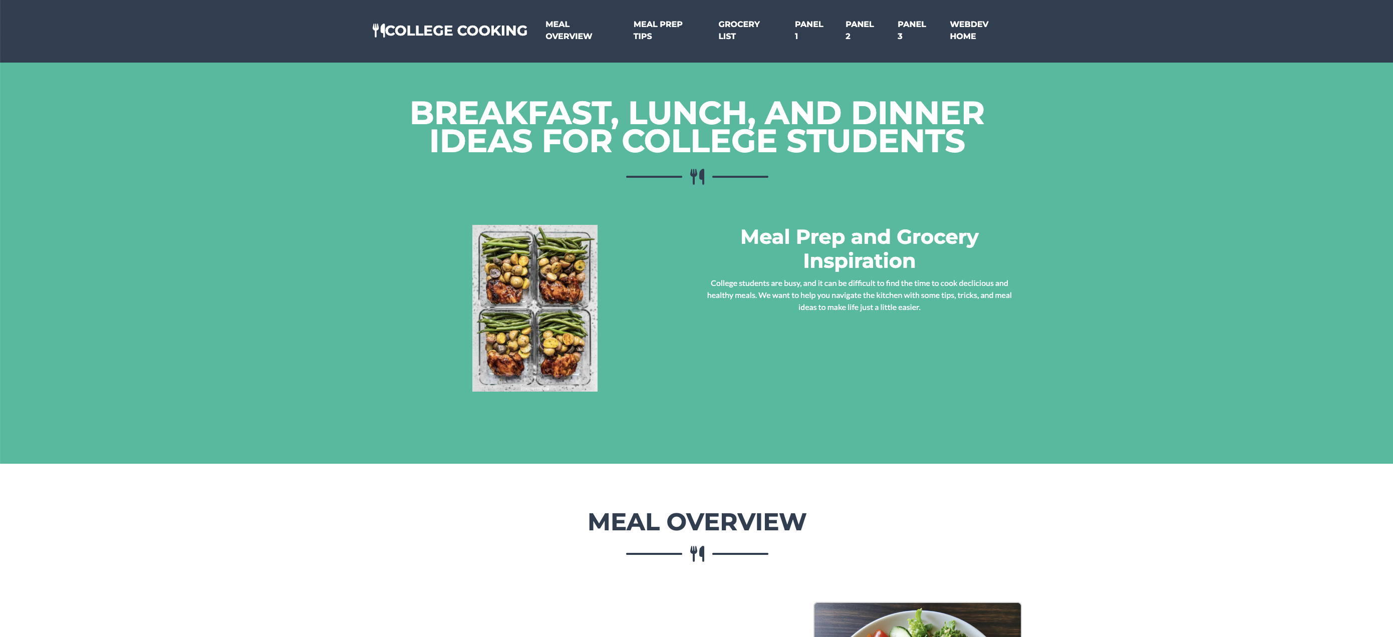
Panel three was definitely my favorite panel to create. I already knew my content super well, knew the aesthetic I wanted to achieve, and getting to see all these elements come together and look like a real website was incredibly rewarding. I loved creating a cohesive color scheme, using not only text and background colors, but also pulling in elements into css like hover colors. There were also small tweaks I was able to make to improve overall design from panel two to three, such as adding space between the utensil icon and site name on my navbar, and correctly resizing my card images. A few of the struggles I encountered were correctly linking my card buttons and adjusting font elements within my accordion, but after trial and error I was able to produce a website that I am truly pleased with. My biggest takeaway after all three panels are to set myself up for success to make the next project easier. Elements like learning how to correctly size images from the beginning, completely finishing one panel/portion before moving onto the next, and being able to get even more creative are a few goals I have for myself moving forward.
Panel Three